

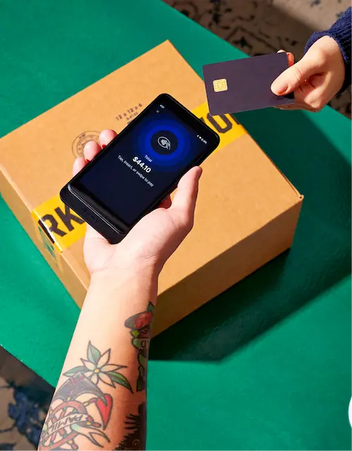


Ecommerce user experience (UX) is how shoppers experience your store, from the moment they land on your homepage to the second they complete a purchase. Every click, scroll, and form field is part of that experience.
Baymard Institute research puts the average cart abandonment rate at 70.22%, and large ecommerce sites could recover up to 35% of those lost orders through better checkout design alone.
This guide covers every stage of the shopper journey: homepage, navigation, product pages, cart, checkout, mobile, and page speed. You’ll find specific actions to take, the business metrics each action affects, and examples from store owners who’ve seen the results.
What is ecommerce UX?
User experience (UX) is the sum of every interaction a shopper has with your store. It covers how easy it is to find products, how clearly information is displayed, how fast pages load, and how smoothly a purchase goes through.
Ecommerce UX vs. UI
UX is not the same as user interface (UI). UI is what your store looks like. UX is how it works. A store can be visually stunning and still have terrible UX if shoppers can’t find what they need or abandon the cart because the checkout takes too long.
Think of UI as the paint job on a car and UX as the engine. A customer might stop to admire a car’s looks, but they’ll only buy it if it drives well. The same applies to your store. A clean design draws shoppers in, while UX determines whether they stay and buy.
The distinction is important, because it changes where you focus your time. Redesigning your color palette won’t fix a broken checkout flow. Rewriting product descriptions won’t help if customers can’t find your products in the first place. UX work starts with understanding where shoppers get stuck rather than what looks nice.
Metrics that reveal UX problems
The impact of ecommerce UX shows up most clearly in three metrics:
- Conversion rate. The percentage of website visitors who complete a purchase. According to Statista, 1.4% of global ecommerce visits converted into purchases in Q1 of 2026.
- Cart abandonment rate. The percentage of shoppers who add items but don’t check out. Baymard Institute’s analysis of 50 studies puts the global average at 70.22%, so roughly seven out of every 10 shoppers who show enough intent to fill a cart leave without buying.
- Bounce rate. The percentage of visitors who leave after viewing one page. Contentsquare’s 2025 Digital Experience Benchmarks report found that slow-loading content caused 53% of users to leave after visiting just one page.
How UX impacts conversion rate, cart abandonment, and retention
These metrics determine how efficiently your store turns traffic into revenue. Every marketing channel eventually feeds into the same question: What happens after someone arrives?
When shoppers struggle to find a product, they’re more likely to leave your site altogether. When unexpected shipping costs appear late in the checkout process, many abandon their carts. And when the path to purchase feels confusing or time-consuming, customers are less likely to complete an order or return in the future.
Homepage and navigation UX
Before a shopper can buy from you, they need to find what they’re looking for. Your homepage and navigation are what make that possible, or what make it hard enough that they leave.
Keep your main menu to 7 items or fewer
The Shopify Help Center recommends no more than seven main navigation items. This idea is linked to cognitive psychologist George Miller’s foundational research on working memory, which is often the basis for how UX designers approach information architecture.
If your store has many categories, use a nested menu structure rather than listing everything at the top level. For example, you might have a top-level menu item like “Women’s Clothing” that expands to subcategories.
Clothing brand Overtime has seven items in its navigation that expand down into subcategories.

Build a logical product hierarchy customers can navigate instinctively
According to Baymard Institute research, 58% of desktop sites and 67% of mobile sites have “mediocre” to “poor” homepage and category navigation UX.
Your navigation should reflect how shoppers browse, not how your inventory is organized internally. A customer looking for a birthday gift typically starts with an occasion, recipient, or product type, not SKU numbers or supplier categories.
Test your navigation with people who haven’t seen your store. Give them a task, like “Find a waterproof jacket under $80,” and watch where they go. If they end up in the wrong category or use the search bar straight away, you might need to tweak your navigation hierarchy. You can also use a tool like User Testing to see how people move around your ecommerce website.
A well-structured hierarchy also helps search engines understand your ecommerce site. Clear category URLs and logical nesting make it easier for Google to index your products and for shoppers to arrive on the right page from organic search.
How Shopify’s Theme Editor and nested menus support clean navigation
Shopify’s Online Store 2.0 themes are built with navigation structure in mind. The Theme Editor lets you build and rearrange navigation menus without touching any code, which is useful when you’re testing different structures to see what shoppers respond to. You can also create nested menus with multiple levels, so a top-level Collections item can expand to subcategories, then to individual product types.
Beauty brand Omy Laboratoires worked with agency Novatize to optimize their navigation menu specifically for shoppers buying complex customizable products. The restructured navigation made the purchasing experience much more fluid, and Omy now processes 95% of their sales through ecommerce.

Product page UX best practices
Your product page is where purchase decisions are made. It’s the digital equivalent of a customer picking up an item, turning it over, reading the label, and deciding whether it’s worth buying.
Must-have elements
A product page that converts needs to answer every question a shopper has before they have to ask it. According to Salsify’s 2025 Consumer Report, 71% of shoppers have returned an item due to inaccurate product descriptions.
These are the elements that do the most work:
- High-quality images. Multiple angles, zoom functionality, and lifestyle shots showing the product in use.
- Clear, specific product descriptions. Seventy-seven percent of shoppers rely on clear product titles and descriptions when making a final purchase decision. Describe the product as if the shopper can’t touch it; include information about materials, dimensions, weight, and care instructions.
- All product options visible upfront. Make sure size, color, and variant selectors are immediately visible.
- Availability status. “In stock,” “Only 3 left,” or “Out of stock” stops shoppers getting to the checkout only to discover the item isn’t available.
- Price and shipping costs. Unexpected costs at checkout are the top driver of abandonment, per Baymard Institute. Show shipping costs (or a free shipping threshold) on the product page.
You can also add live chat via Shopify Inbox for real-time customer support while shoppers are browsing.
How to present product variants without creating confusion
Make selected options stand out (use a border, fill color, or checkmark—not just a slight change in color), disable out-of-stock variants with a clear indicator rather than hiding them, and show a price update immediately when a variant changes the cost.
For stores with many variants, Shopify Search & Discovery lets shoppers filter by size, color, material, and other product attributes. This moves variant selection earlier in the user journey so shoppers arrive on product pages that are already filtered to options that work for them.
Everlane spotlights the chosen variants in a contrasting color—black against the white background.

Using reviews and social proof to answer the questions your copy can’t
Product descriptions answer the “what.” Reviews answer the “Does it actually work?” A PowerReviews survey found that 86% of shoppers read reviews on retailer websites before making purchase decisions.
The Bazaarvoice Shopper Preference Report found that 52% of shoppers cite real customer reviews as the single biggest factor in their final purchase decision.
A couple of things to bear in mind:
- The minimum threshold matters more than total volume. Getting the first handful of reviews on a new product is more important than accumulating more on a product that’s already well reviewed.
- Responding to negative reviews builds trust. While no business can satisfy every customer, a thoughtful response shows that you take feedback seriously and are willing to address concerns when things don’t go as planned.
How Society6’s redesign lifted add-to-cart rates 60% with intuitive navigation and discovery
Society6 is an online marketplace where independent artists sell their work on products.
Customer research confirmed that shoppers were struggling to find inspiration or understand what made Society6 different from any other online store. Artists, who needed a reason to invest time in their storefronts, found the platform gave them little to work with. The brand prided itself on being artist-first, but that wasn’t coming through in the experience.
Society6 partnered with Shopify agency Pattern to rebuild on Shopify Plus. The project ran for a year and covered more than a visual refresh. Along with refreshing the site’s appearance, Pattern also rebuilt the information architecture, product discovery flows, and underlying component system from the ground up. The new store was designed specifically for browsing by inspiration rather than by product type, which is how shoppers looking for art-driven products actually behave.
“We initially engaged [Pattern] to lead the redesign for our website, but ended up with a thoughtful and strategic partnership that extended beyond just new UX/UI,” says Brit Tucker, vice president and head of product and ecommerce at Society6. “Every step of the project tied back to the research, including expanding our personas, refining our values, and layering in pulses of focus groups and user testing throughout the project.”
The result: A 60% average increase in add-to-cart rates and a 45% increase in mobile conversions. Shoppers also spend more time exploring artists’ work.
Cart and checkout UX
Shoppers can make it all the way through browsing and product research and still leave before paying. Here’s how to reduce the chances of that happening.
Reducing cart abandonment with transparent costs and fewer steps
The top checkout-related drivers of cart abandonment, per Baymard Institute’s 2025 research:
- 39% encountered extra costs (shipping, taxes, fees) appearing at checkout
- 19% were asked to create an account before purchasing
- 18% found the checkout process was too long or complicated
These are all fixable. Show shipping costs early (on the product page or in the cart) so shoppers aren’t surprised at the final step. Make guest checkout the default option. Then, audit your checkout flow. How many form fields does a shopper have to fill out? The average ecommerce website has 23.48 form elements, but Baymard’s research found an ideal checkout flow can be as short as 12 to 14 form elements.
One-page checkout vs. multistep: When simplicity wins
One way to reduce friction is to remove unnecessary steps. Shopify’s one-page checkout consolidates order details, shipping, and payment onto a single screen. Shoppers can see everything at once without clicking through multiple stages to complete a purchase.
For stores with straightforward products and standard shipping, a one-page checkout is almost always the better UX choice.
Multistep checkouts can still work for stores with complex order configurations, such as custom products or specialized shipping requirements. Breaking those decisions into stages makes the process feel more manageable.
Accelerated checkout and guest checkout as UX tools
Accelerated checkout removes the biggest source of mobile friction: manual form entry. Shop Pay, Shopify’s accelerated checkout option, stores a shopper’s shipping and payment details so returning shoppers don’t have to enter it again if they come back.
Shopify’s data shows Shop Pay lifts conversion by up to 50% compared to guest checkout and outperforms other accelerated checkout options by at least 10%.
Guest checkout removes a different source of friction: account creation.
Making guest checkout prominent, or at least as visible as the login option, removes that barrier for first-time buyers.
Mobile ecommerce UX
According to Statista, mobile accounted for 59% of global retail ecommerce sales in 2025, up from 57% in 2024. Q1 2025 data compiled by Statista shows that 68% of online shopping orders were completed on smartphones, a figure that has nearly doubled over the past four years.
Ecommerce UX on desktop and mobile should be treated as two separate tasks.
Mobile-first design
Mobile-first UX design means designing for the smaller screen first, then adapting the experience for larger devices. Doing the opposite (focusing desktop design first and translating it to mobile) can create a poorer mobile experience for shoppers.
Simplifying for small screens
On mobile, less is more.
For forms, remove every non-essential field. Use autofill (available through accelerated checkout options like Shop Pay) so shoppers don’t have to thumb in their address every time.
For menus, collapse secondary categories behind clear top-level items. For images, the Shopify Help Center recommends aiming for files of less than 200 kilobytes and 2048 by 2048 pixels for square product images, which is large enough to zoom in on but doesn’t slow down the page.
Groupe Marcelle, the Canadian beauty brand on Shopify Plus, rebuilt their mobile experience specifically to address slow load times that were driving higher abandonment. This led to a 6% improvement in conversion rate during peak season and measurable improvement in mobile speed and navigation.
Testing your store’s mobile experience end to end
Viewing your store on a desktop browser in a small window is not the same as using it on a phone. Test on actual mobile devices, on a real mobile network (not Wi-Fi), and with mobile users who aren’t familiar with your store.
Walk the full purchase journey: Find a product through navigation (not search), add it to cart, and complete checkout, making a note of every time you have to zoom, re-tap, or read small text.
Page speed as a UX factor
A slow store can directly lose you sales. Yottaa’s 2025 Web Performance Index found that shaving one second off page load time increases mobile conversions by 3%. The same data found pages that take more than four seconds to load have a 63% bounce rate.
Check the apps installed on your store, as they could be slowing you down. Every widget, live chat tool, analytics script, and marketing pixel each adds code that runs every time a page loads and slows it down. Yottaa’s data shows third-party apps account for 44% of average page load time, which means your store’s slowness may have nothing to do with your theme or your images, and everything to do with which apps you’ve installed.
What Core Web Vitals mean for your store’s user experience
Core Web Vitals are Google’s framework for measuring how real users experience a webpage. There are three metrics:
- Largest Contentful Paint (LCP). How long it takes for the main content (usually a product image or hero image) to load. A good LCP score is achieved when the main content is loaded within 2.5 seconds from the start of the page load.
- Interaction to Next Paint (INP). How quickly the page responds when a shopper clicks something. An INP score of less than 200 milliseconds is considered a good performance as the page becomes interactive quickly.
- Cumulative Layout Shift (CLS). How much the page layout changes while loading. A CLS score of less than 0.1 is considered a good performance.
Google’s research shows that sites meeting all three Core Web Vital thresholds see 24% fewer page abandonments. These metrics have been Google ranking signals since 2021, which means they influence both your store’s visibility in search results and the experience shoppers have once they arrive.
How to use Shopify’s web performance reports to find and fix speed issues
Shopify rolled out a web performance dashboard in early 2024, accessible from your Online Store → Themes page.
Unlike the older Speed Score, which used simulated lab data, the dashboard uses real user data to show your LCP, INP, and CLS scores across your actual visitors, on their actual devices.
The Shopify Help Center’s web performance overview explains how each metric is measured and what affects scores. For deeper diagnostics, Google’s free PageSpeed Insights tool shows page-level issues and prioritizes them by impact.
How to measure and improve your ecommerce UX over time
Things change. Shopper expectations shift, your product range changes, and a checkout flow that converts well today might not do as well in six months. Creating a consistently positive user experience means building a habit of measuring, finding friction, testing a fix, and measuring again.
Key UX metrics to track
These are the numbers that can tell you where your ecommerce UX is working and where it’s not:
- Bounce rate by page type. High bounce rates suggest the page isn’t meeting user expectations. High bounce rates on the homepage suggest there’s an issue with navigation or your overall messaging.
- Session depth. How many pages do shoppers visit before leaving? Low session depth often means shoppers can’t find what they came for, which is ultimately a navigation problem.
- Conversion rate. A low conversion rate can mean shoppers aren’t finding the information they need to make a purchase. Compare your average conversion rate with industry and category benchmarks. For example, in May 2026, pet care and veterinary services had the highest conversion rate, at 7.15%.
- Cart abandonment rate. Track this in your Shopify analytics. A spike in abandonment after a site change is a clear signal that something’s not working.
- Mobile vs. desktop conversion rate. A gap of more than a few percentage points between mobile and desktop conversion rates could mean your desktop design doesn’t translate well to mobile.
Using heat maps, session replays, and A/B testing to find friction
Analytics tools show you what’s happening, like how many people bounced or how many abandoned. But these behavioral tools show you why:
- Heat maps. Use a tool like Contentsquare to see where shoppers click, tap, and scroll on your ecommerce website. For example, you might find that most shoppers never scroll below the hero image on a particular product page, which needs addressing.
- Session replays. Watch recordings of individual shopper sessions. Microsoft Clarity offers this for free, or you can use Contentsquare for more advanced segmentation on paid plans.
- A/B testing. Show two versions of a page to different groups of shoppers at the same time, so you can measure which one actually converts better. Run one test at a time, with enough traffic to reach statistical significance, before declaring a winner and moving to the next change.
Building a continuous UX improvement loop
The loop works like this:
- Set a baseline. Know your conversion rate, abandonment rate, and bounce rate before you change anything.
- Identify a specific friction point. Use heat maps, session replays, or checkout analytics to find where shoppers are dropping off.
- Form a hypothesis. “If I make the guest checkout option more prominent, abandonment from the account-selection step will fall.”
- Run a test. A/B test the change against a control group.
- Measure the outcome. Did the metric you were targeting improve? By how much?
- Ship the winner. Then identify the next friction point and repeat.
Natura Selection, a fashion and lifestyle retailer, took a targeted approach to product page UX. They created differentiated product description templates for different product types to replicate the sensory experience of their physical stores online. This resulted in a 13% increase in conversion rate and a 3% increase in add-to-cart.
Read more
- How to Build a FAQ Page- Templates & Examples to Inspire You
- 7 Innovative Customer Loyalty Programs and How To Start
- The 39-Point Store Trust Checklist- How Trustworthy Is Your Online Store?
- Conversion Rate Optimization- How to Get Started with CRO
- Ecommerce Copywriting 101- How to Write Words That Sell
- The Secret To Building a Profitable Sales Funnel With Ecommerce Expert, Ezra Firestone
- 9 Google Analytics Custom Reports by the Experts (and How to Use Them)
- 5 Psychological Design Tactics that Make Brains Tick and Visitors Click
- The Hidden Potential of On-Site Personalization (And 3 Ways to Get Started)
- Website Builder & Website Maker by Shopify
Ecommerce UX FAQ
What is the 80/20 rule in UX?
In UX, the 80/20 rule (also called the Pareto principle) suggests that 80% of usability problems come from 20% of the issues on an ecommerce site. For ecommerce stores, the biggest usability gains come from fixing a small number of friction points, like unexpected checkout costs, forced account creation, and slow mobile load times.
What is the difference between ecommerce UX and ecommerce CX?
Ecommerce user experience (UX) covers the on-site experience, like how easy your store is to navigate, how fast pages load, and how smooth checkout is. Customer experience (CX) is broader. It includes everything from how a shopper first discovers your ecommerce business through to delivery, returns, and post-purchase support. A store can have excellent UX and still lose customers to poor CX if products arrive late or returns are complicated.
What are the most important elements of good ecommerce UX?
Good ecommerce UX includes fast load times, intuitive navigation, clear product pages with accurate images and transparent pricing, a frictionless checkout with guest checkout available, and a mobile experience that works as well as desktop.
How does page speed affect ecommerce UX?
Slow pages cost sales directly. Reducing load time by one second boosts mobile conversions by 3%, while pages that take longer than four seconds to load have a 63% bounce rate. Speed also affects how easy it is to find your store in the first place, since Core Web Vitals are a Google ranking signal.
How do I improve UX on my ecommerce site without a designer?
Start with the data you already have. Check your Shopify analytics for your highest-abandonment pages and install a free session replay tool like Microsoft Clarity to watch where shoppers get stuck. Then test your store’s full purchase journey on a real mobile device—find a product through navigation, add it to cart, and complete checkout. The friction points you encounter are the same ones your shoppers are hitting every day, and most can be fixed without design work.